I don’t necessarily think that making it big has to do with notoriety, rather success on the person’s own scale. When I think of myself making it big, I think of being a designer with an established practice that really specializes in tending to local communities; especially the people that are doing amazing things but can’t afford to hire a huge agency. I don’t want to be an instagram famous designer that gets a lot of hype or sell my soul to a company that has immoral practices. I’d rather have my work serve a purpose and get people excited based on the ideas present and the process. But also having it look nice wouldn’t hurt. I just want to make cool things with friends and like minded people. But that is just my version of making it big. I suppose it’s just a matter of having dreams and goals, and working hard to achieve them without stepping on everyone in your path.
I have a brain full of obscure references that I tap into frequently. But while my work is fun and light, the current political climate of the world and my own anxiety also contribute heavily to the language and imagery present in my work.
Running t-shirt show with Jessica was huge for me. It changed the way I approach design, collaboration, and even friendship. Truly a turning point and something I’m very grateful for.
During BFA1 someone fell out of their chair in crit. My classmates’ reactions were funnier than the fall and were telling of the coming years.
Making weird, meaningful design for weirdos with good hearts.
I’ve realized that while I always thought I thrive on my own, the sense of community is so important to my practice.
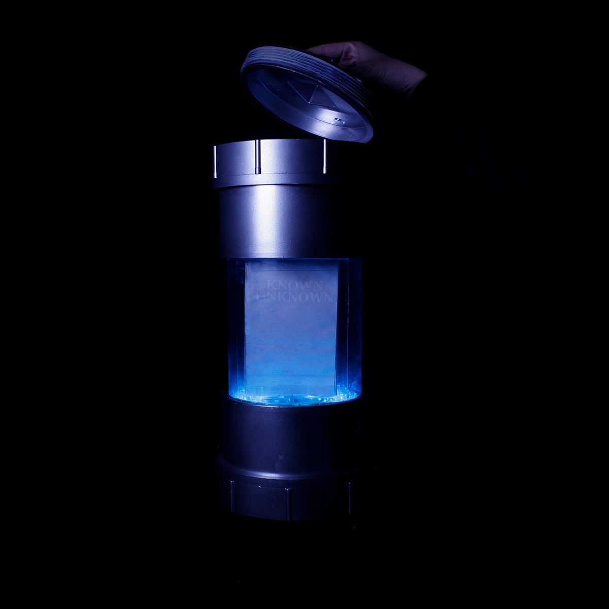
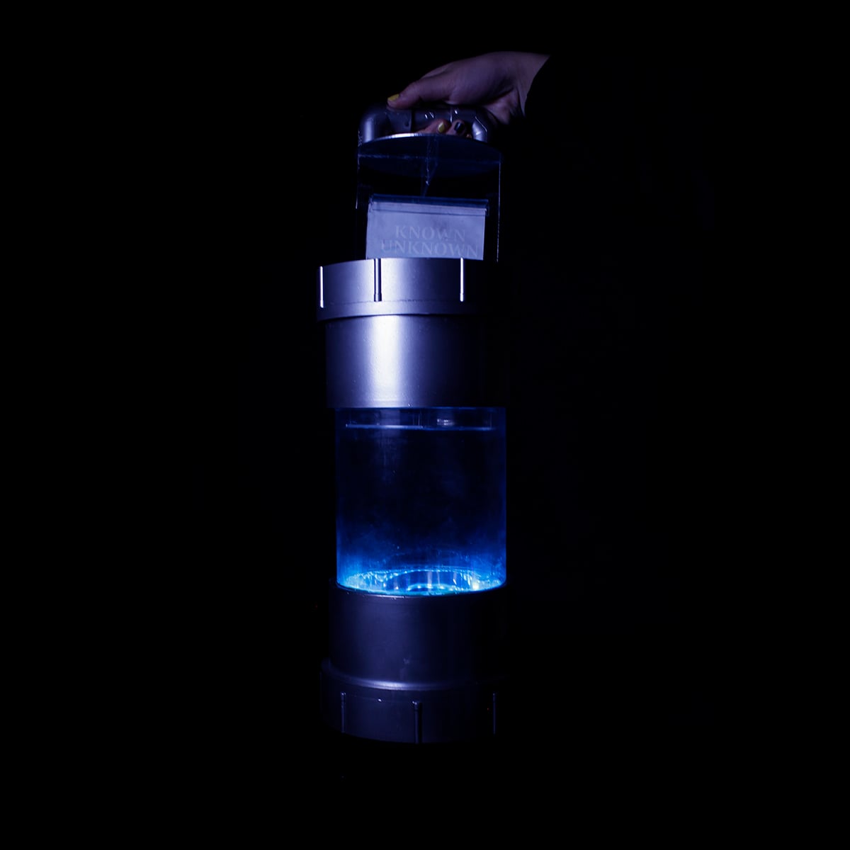
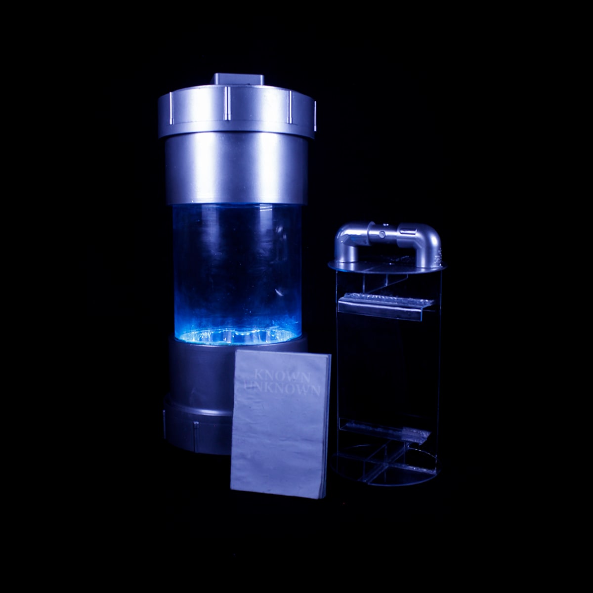
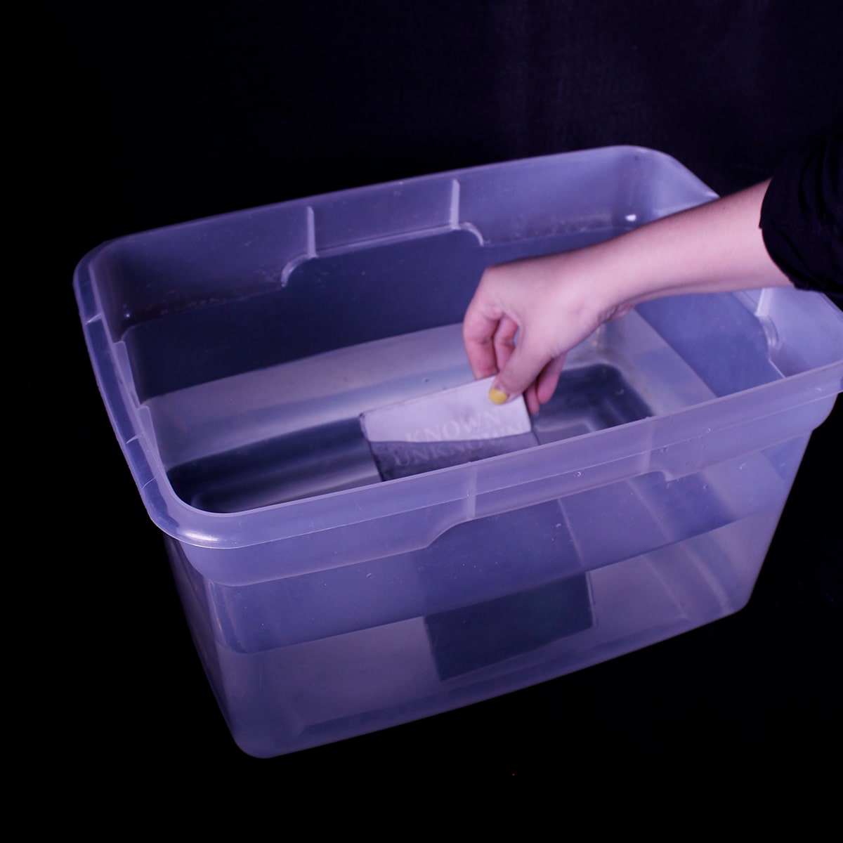
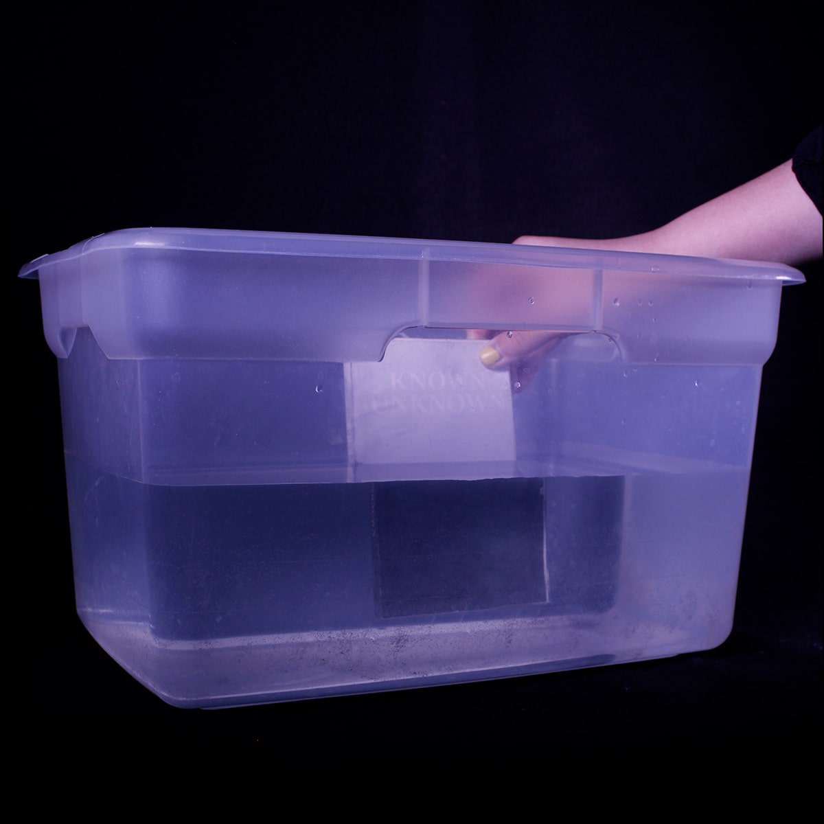
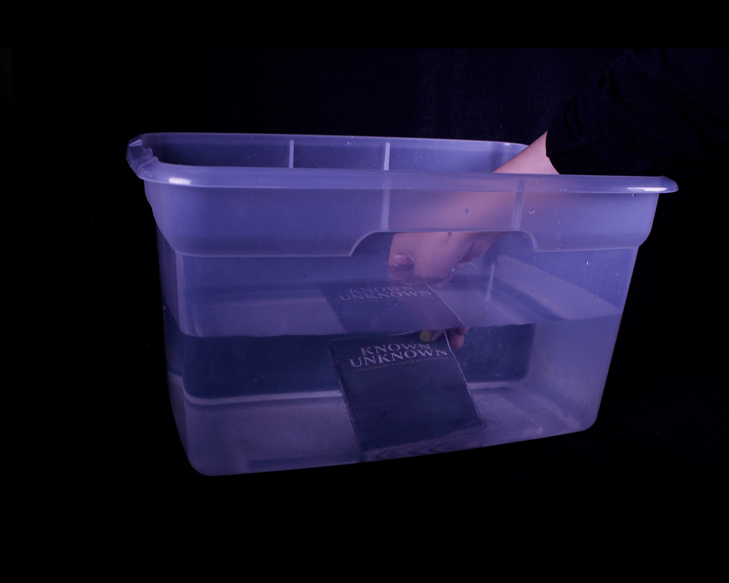
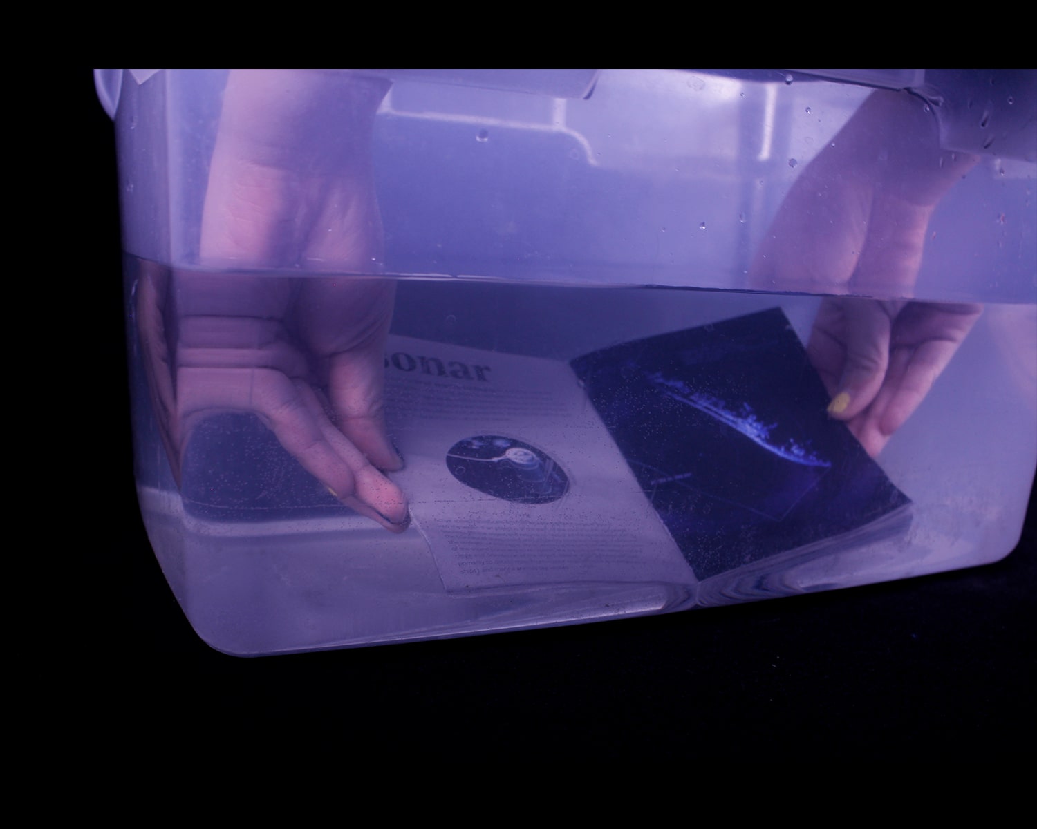
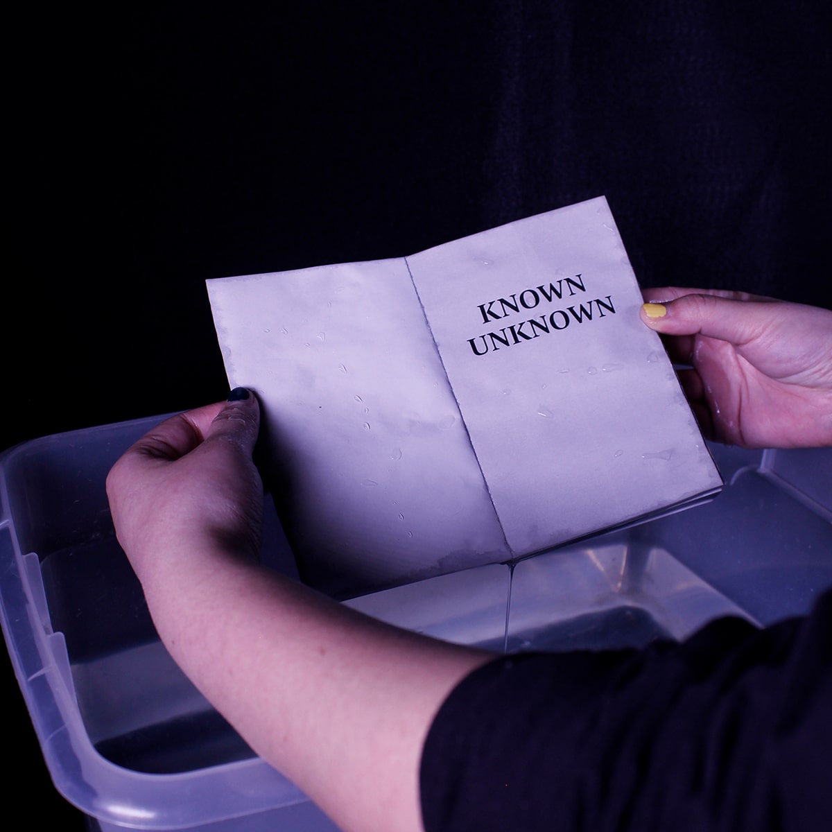
Known Unknown is an exploration of the correlations between the existing uncharted waters on earth and the undiscovered potential of the human mind.
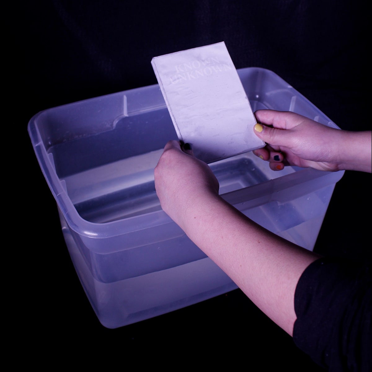
This handbook is 50 pages, beginning based in scientific fact, but deconstructing throughout to uncover questions that science cannot answer. It is enclosed in an illuminated, custom built water-tight case, meant to withstand the intense pressure of the ocean floor, and printed on environmentally friendly waterproof paper. The cover has a layer of hydrochromic ink which, when submerged in water reveals the cover design and more information on the book, but appears white when opened out of water.
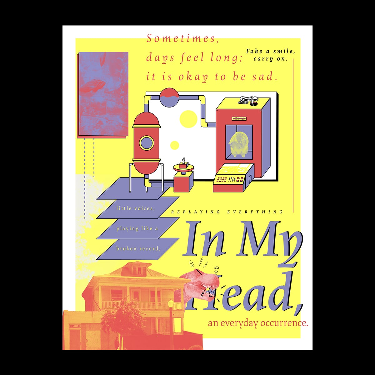
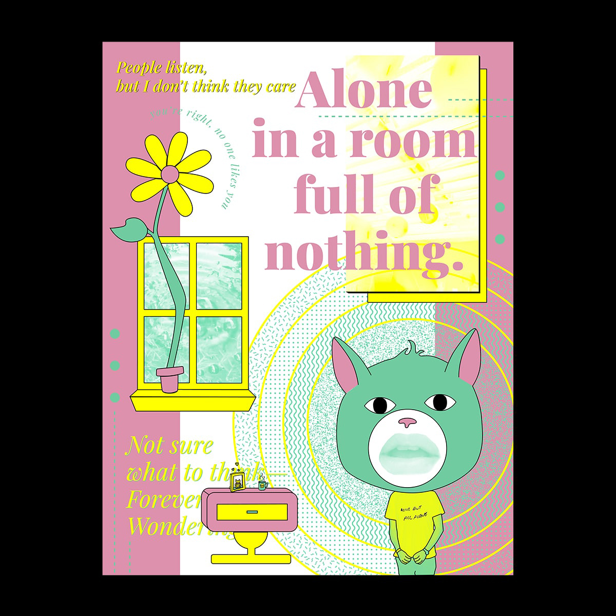
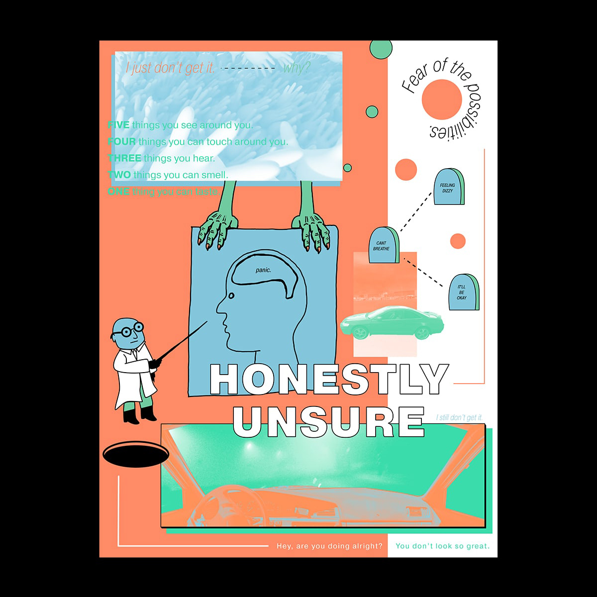
A series of three screen printed posters that would be projection mapped on. These posters would focus on generalized anxiety disorder, social anxiety and panic disorder.Topics that I have researched in the past but had never made a project I felt was complete. Design was difficult because I tried to explore new ways of form making through predominantly digital processes. The looming doom surrounding the world helped me realize the importance of language and these became type dominant , which is also something I rarely tackle. I also recorded and mixed a sound piece that is meant to sound anxiety inducing with very little release at the end.
Following the shut down of campus it was clear I was unable to present this project in the format it was originally intended to be shown in, however it will be completed once I am able to screen print these posters. Also included are early tests of what would be projected on the posters with the audio piece played. In process included on this site as motivation to see this project through to the end.
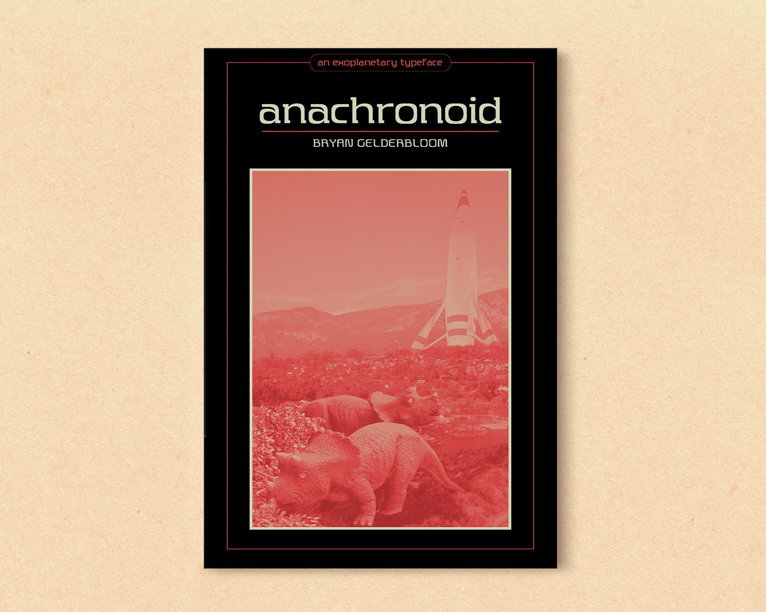
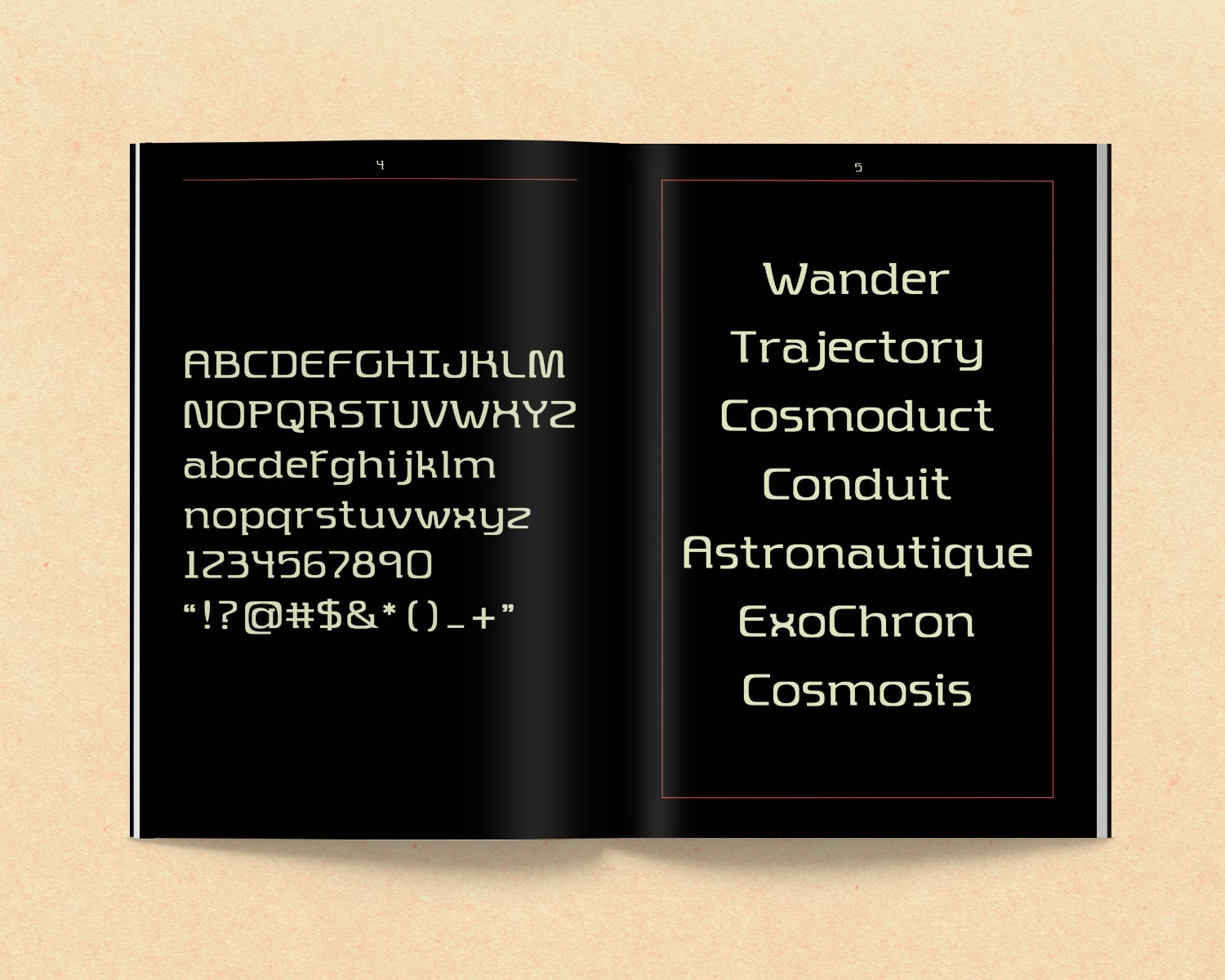
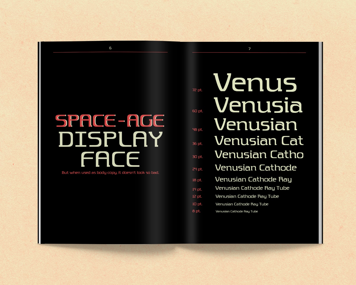
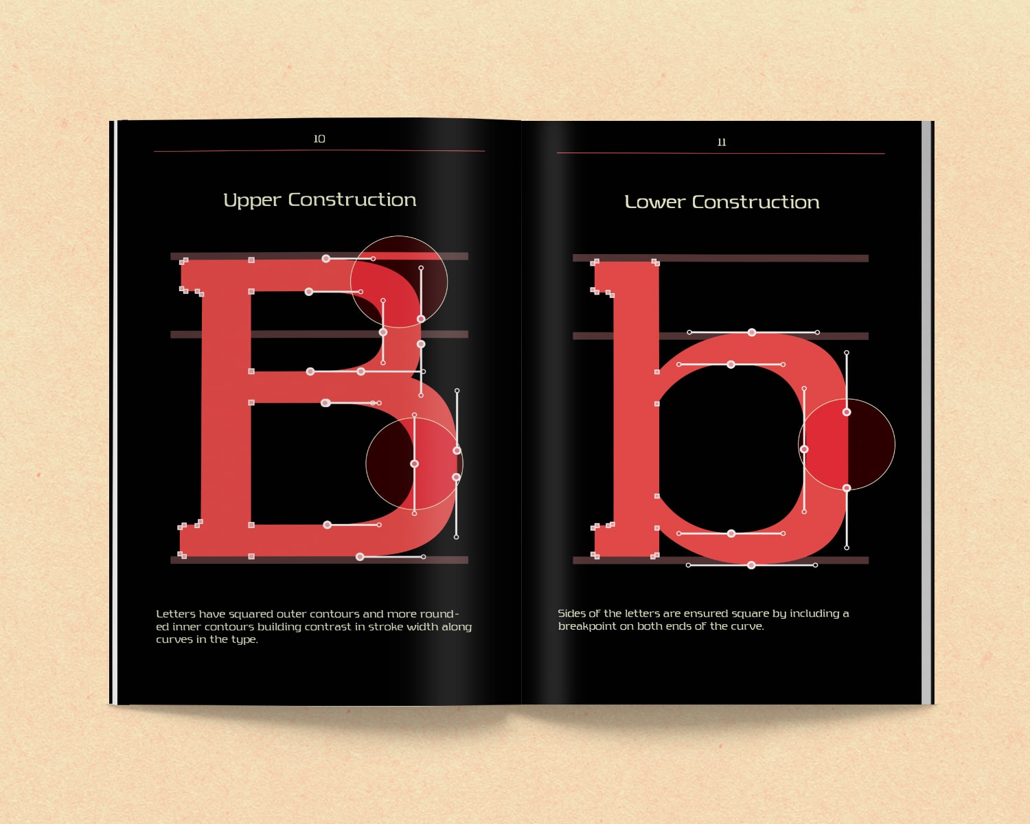
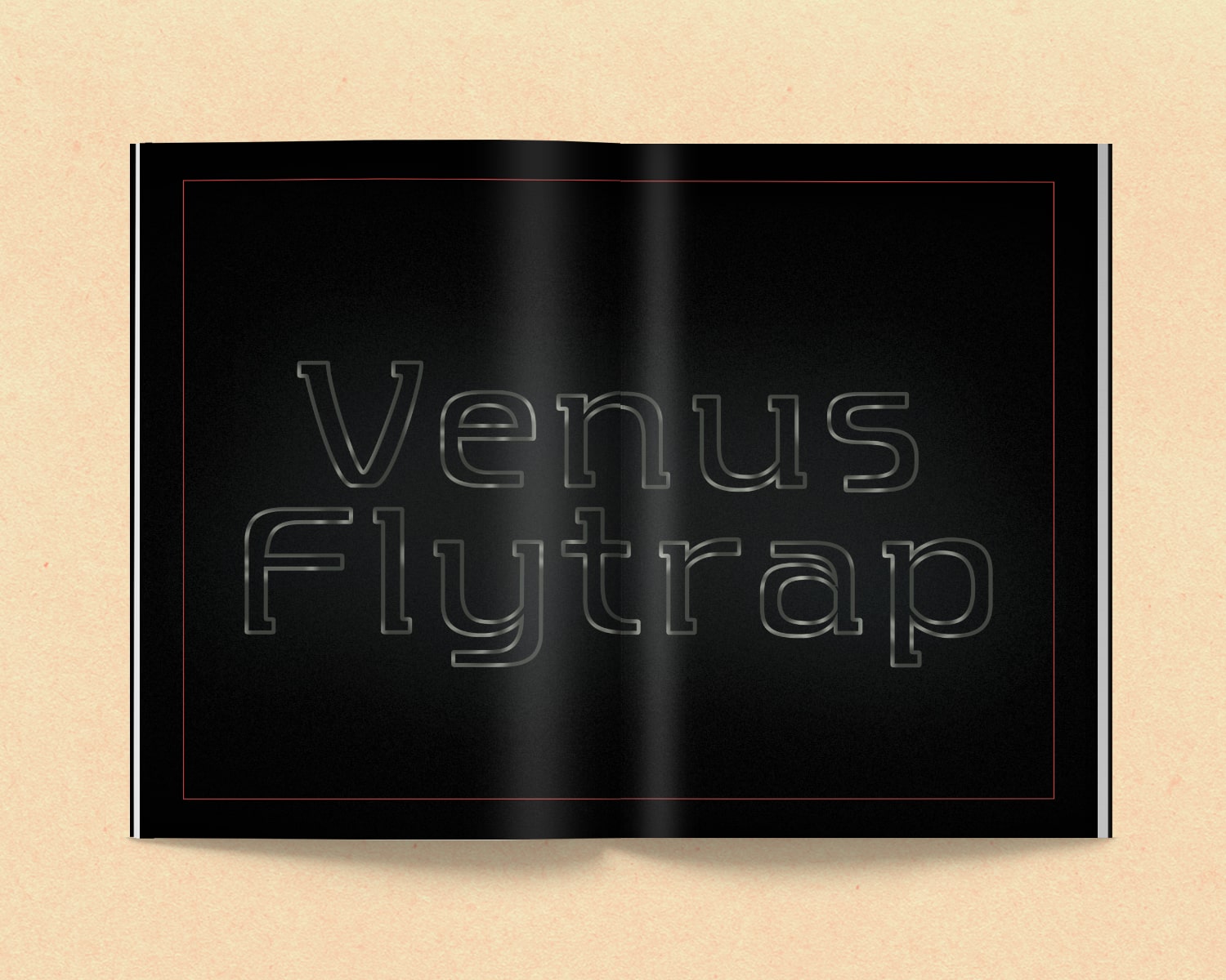
Anachronoid is based on geometric typefaces rooted in retrofuturism that were popularized through use on science fiction book covers. With more squared off outer contours and rounded inner contours, there is contrast in the stroke width, especially seen on generally rounded characters. The idea evolved into a typeface that strayed away from harsh edges, especially those created with diagonal strokes. The typeface also features a slab serif that matches the weight of the thinnest strokes. The serifs are present in some unpredictable spots with the top serifs pointing left and the bottom serifs pointing right, with few exceptions. These serve as something between a structural component and decorative component. While intended to be used as a display face, this typeface isn’t entirely illegible when used for body copy.