I think big does not have to be something "great" and "big" but if oneself has learned something and find out what they should do next, or what they are good/bad at, is still a big movement.
I have tried different styles in my process even though I have ended up with the look that all my works have. I also have learned I can even try something more, without fear. I have found out my new problem and what I need to know, learn in the future.
My classmates' works, everything I see on instagram or around the school.
Should not think of the final look at the first step and sometimes try not to think too deep. It will bother you more.
Very beginning part where have to come up with all different ideas + Refining, where I can make details look better.
Modern, Dark, Mood
Design is not about the visual but also about the communicating ideas. (Connotative, Denotative. So difficult, so important)
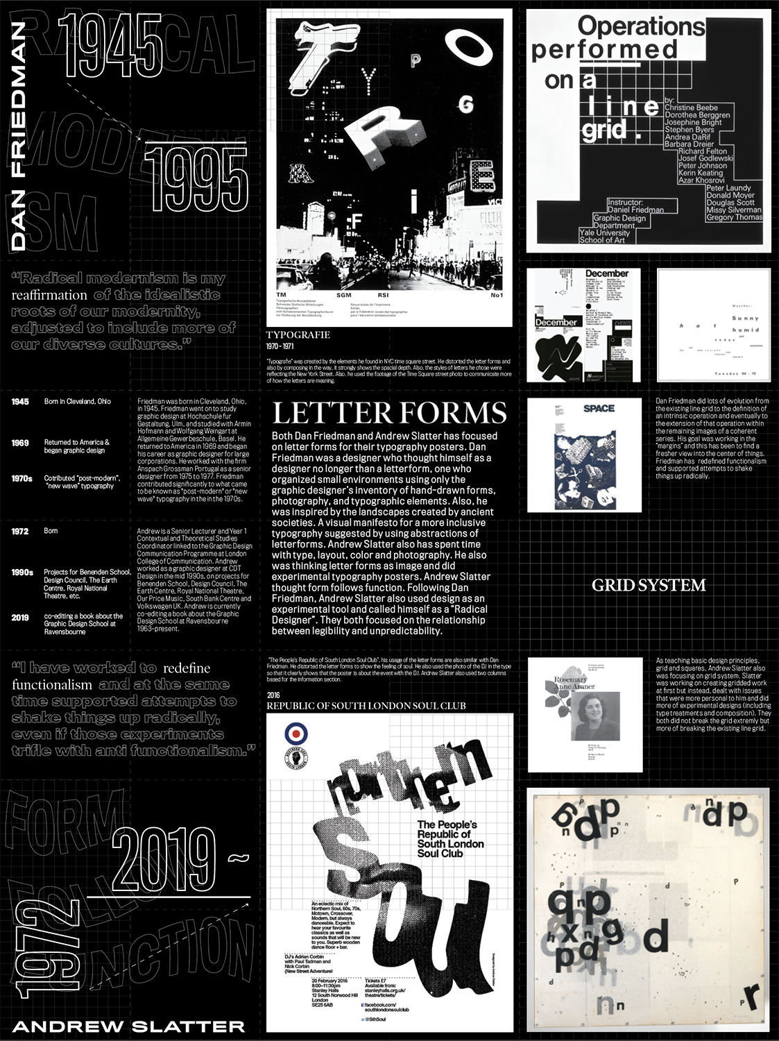
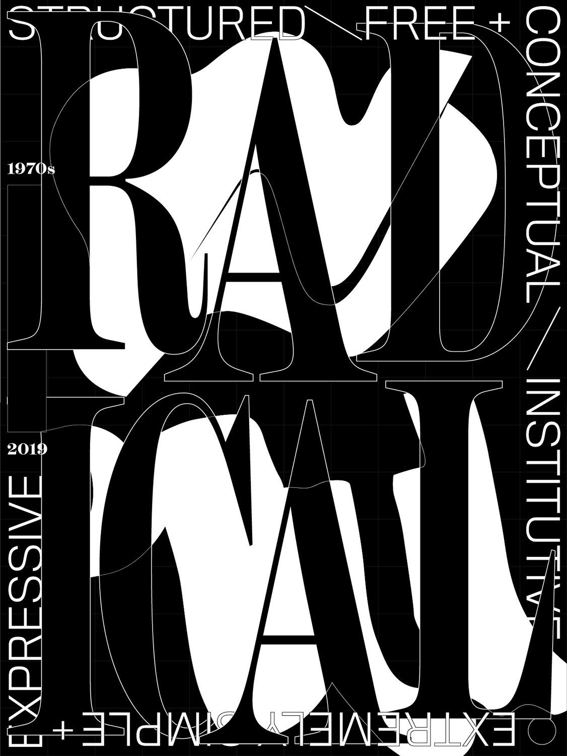
Two Lines Align was a project of finding a contemporary designer who has similar work style with a designer from history and design a poster of making a connection between them. My designer was Dan Friedman and I chose Andrew Slatter to make a connection. One side of the poster is designed with information and the other side is a big poster, showing the idea of two designers’ characteristics.
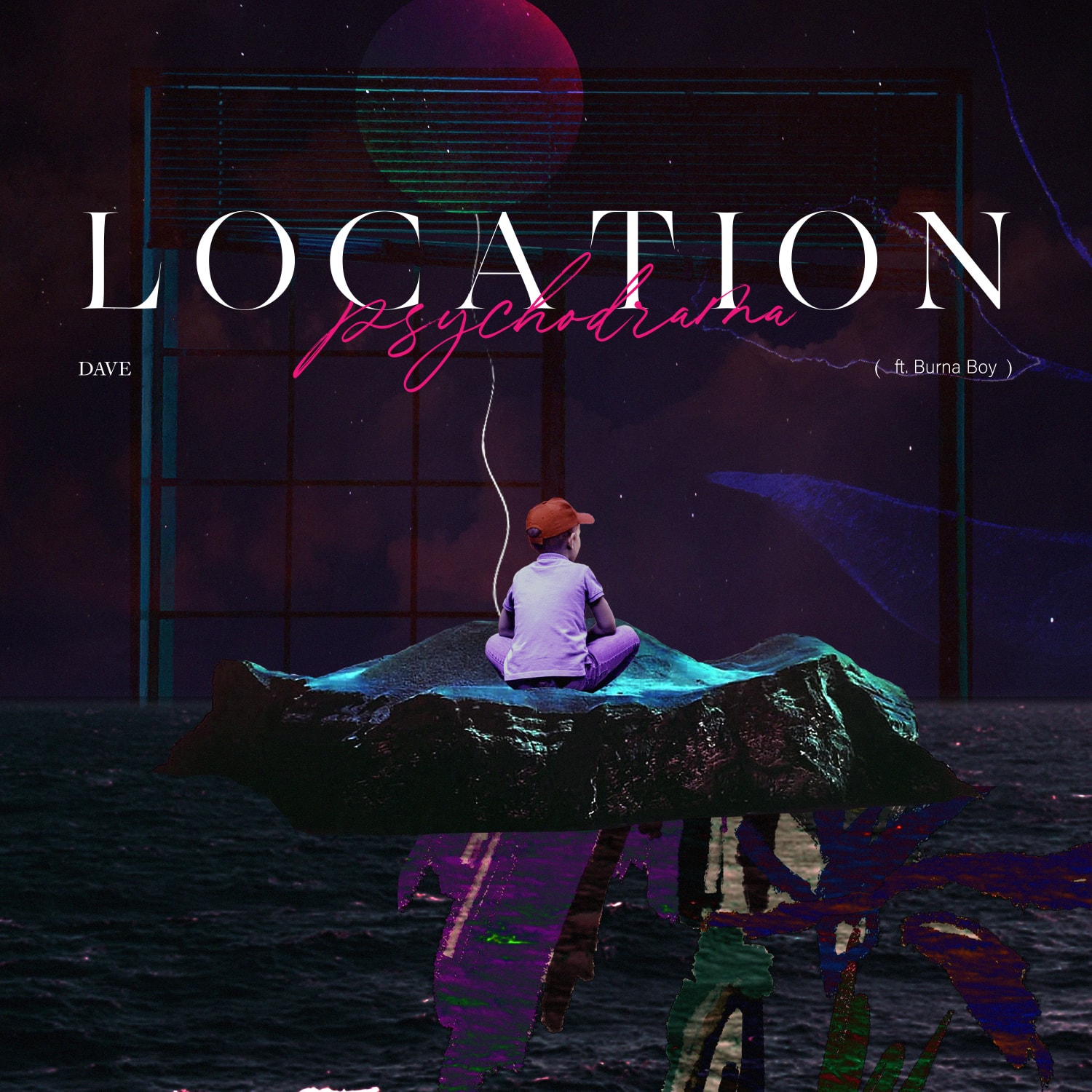
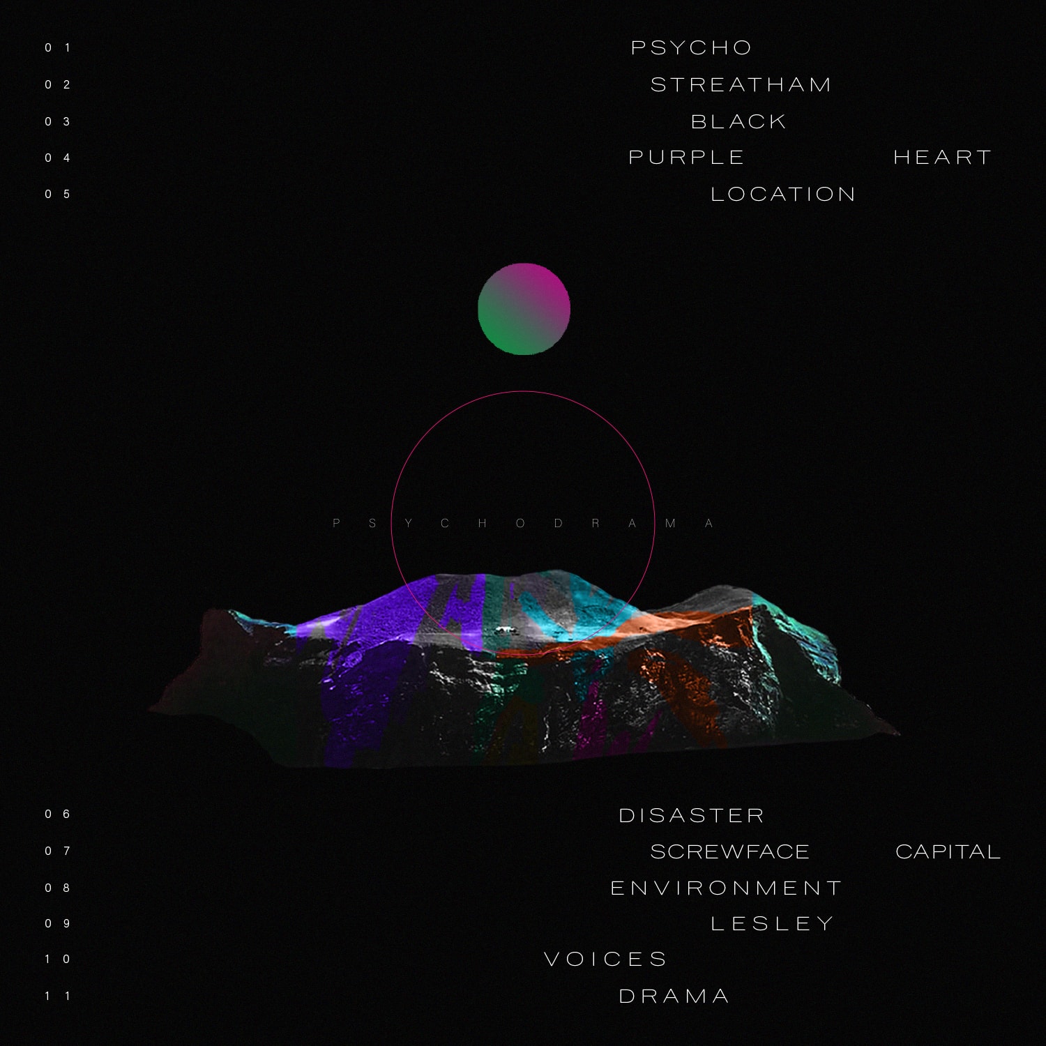
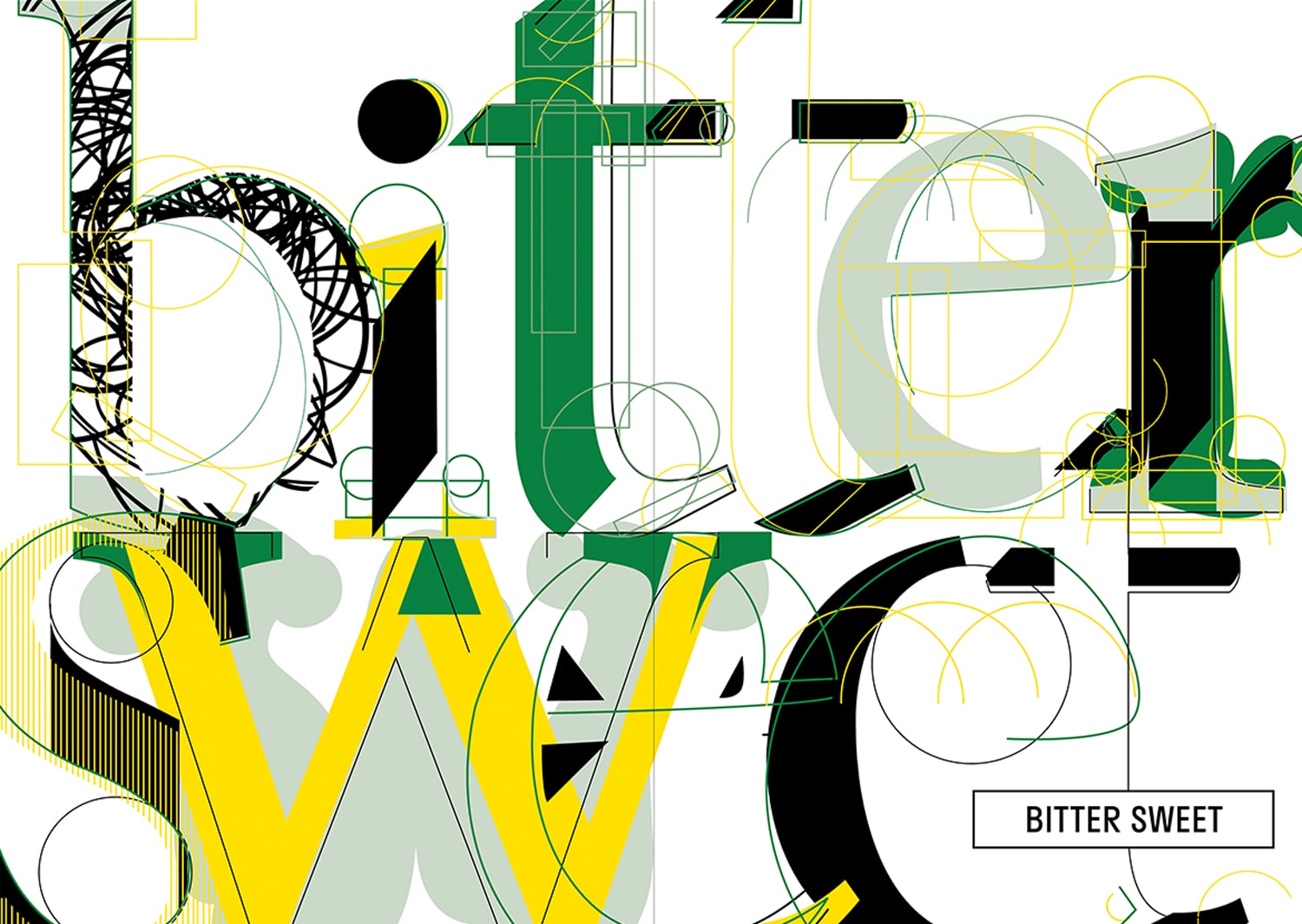
A project given by our TA, Becca Lofchie. We had to choose one song in a random song list and design a vinyl album cover. My song was “Location” by Dave (ft. Burna Boy). Dave is a British rapper and his album including the song Location was his debut studio album “Psychodrama”. Based on the research of his life and his album, he had a hard childhood and he wanted to get through his tough time. By getting the idea from that, I have designed the cover showing the dark dreamy mood with a child so that viewers also can get his ideology.
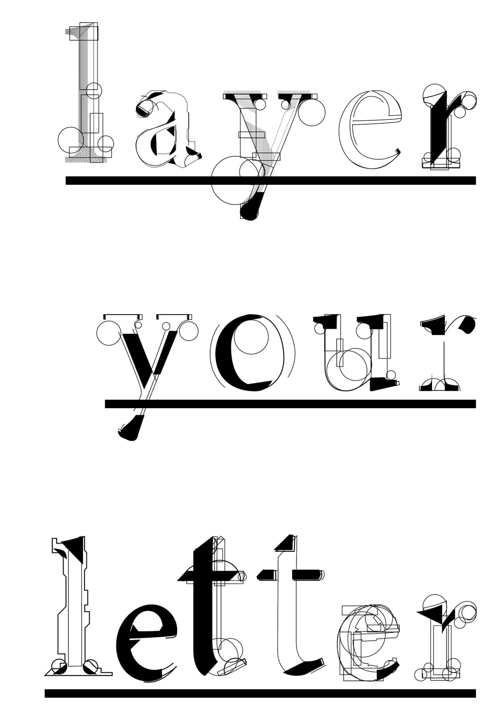
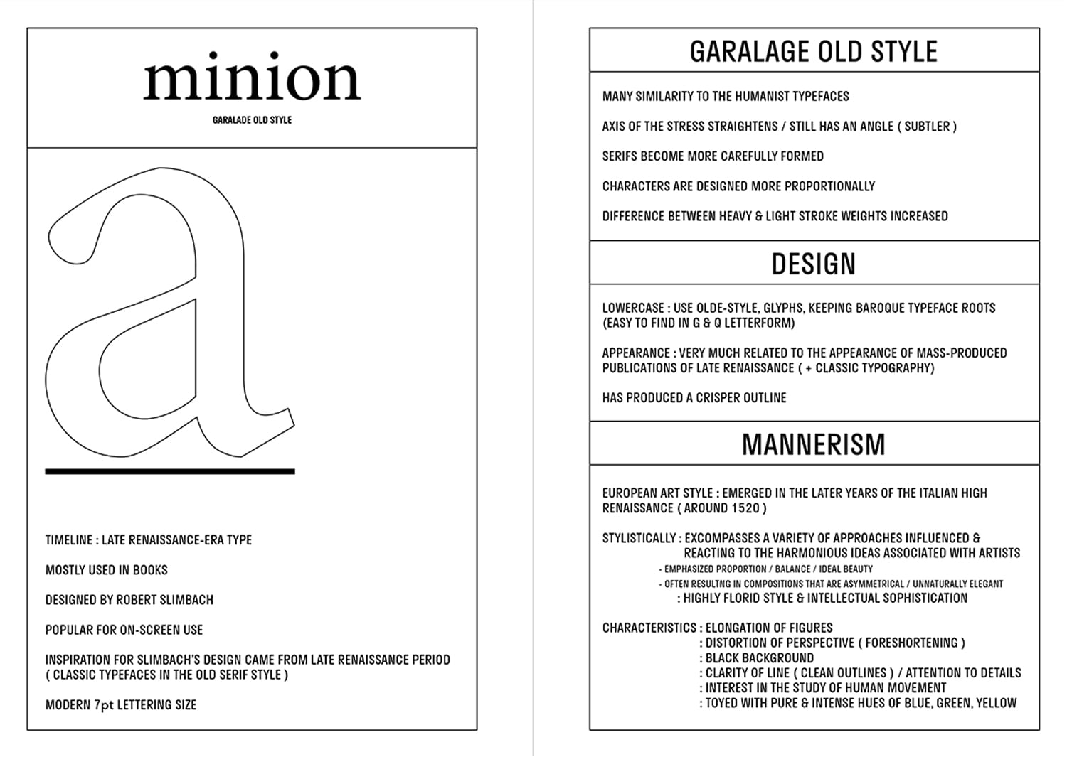
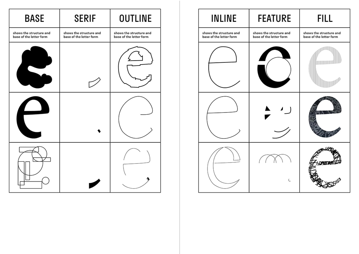
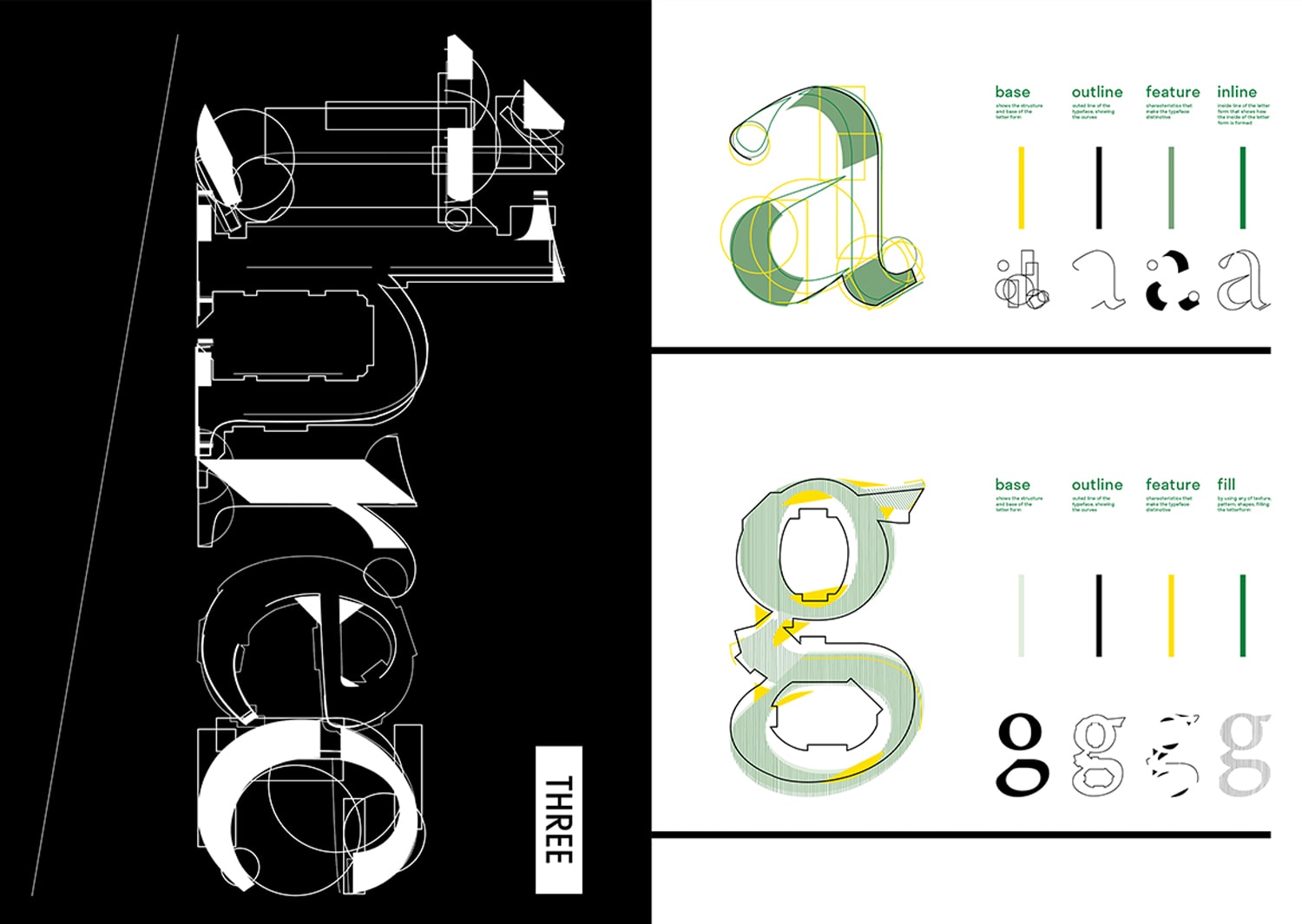
A project done in Gail’s type class, choosing a typeface and redesigning the letters based on the characteristics and history of the typeface. I have chosen “Minion” as my typeface and focused on the characteristic of construction and the focus of the movement, Mannerism. Mannerism was a huge movement that happened in the time when Minion was designed and the idea itself was interested in the study of human movement. To communicate these characteristics, I have designed two different styles of letter forms, finding the balance between linear and organic.
Throw The Bauhaus Under The Bus was a workshop that happened with Silas Munro and Ramon Tejada. The workshop mainly focused on how to work outside of each person’s comfort zone and try out different techniques within a short time so that we can find out new knowledge of how much we can push the work further in creative ways. These two pieces are the works that I would have never done by myself but have made me notice that I have the possibility to do different techniques and design styles.